The Concept of Trend
Trend is the main concept of technical analysis.
An uptrend is defined as a series of higher peaks and higher troughs as time progresses on a price chart. A downtrend is defined as a series of lower peaks and lower troughs as time progresses on the chart. If neither of these are true, with peaks at similar levels to each other and troughs at similar levels then price can be described as in a sideways trend. Often though, this situation is referred to as trendless.
The S&P 500 Energy Index (below) is an example of a chart in an uptrend.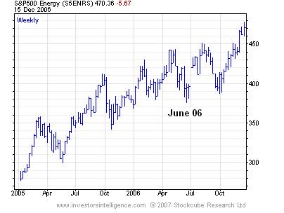
Chart peaks have been higher than the preceding peak and troughs have been higher than the preceding trough. There is a slight imperfection in that during June of this year, the price made a slightly lower trough than the preceding trough. At that time, this would break our strict definition of an uptrend but given that the preceding peak had been higher, we would look for further evidence of a change of trend, which in this case did not occur.
Trends exist over the long, medium and short term and in a sense, are independent of each other. Exact definitions of the durations of these trends can differ but generally speaking, long term trends are defined in years, the medium term is defined in months to weeks and the short term is defined in days and is limited to around three weeks.
There have been periods on the above chart where the short term trend has been down and the duration of the downtrends has bordered on the medium term (you see the ambiguity; don’t get too hung up about it). However at no point have those short term downtrends been of long enough duration to end the long term uptrend.
When discussing trends, peaks and troughs, we should consider all price action; that is, we should include the intraday highs and lows and not just the closing price. That means that we should use bar charts or candlestick charts rather than line charts. Having said that, the closing price is the most important of the day.
Trendlines are tools that help us define trends and determine when they have ended. As with the trends themselves, they can be drawn over differing timeframes. The procedure is as follows.
1. Determine the period of consideration; whether long, medium or short term.
2. For an uptrend within the period considered, draw a line from the lowest low up to the highest minor low point before the highest high, such that the line does not pass through any of the price bars.
3. For a downtrend within the period considered, draw a line from the highest high down to the lowest minor high point before the lowest low, such that the line does not pass through any of the price bars.
The chart (below) shows two medium term downtrends that were broken when the long term uptrend resumed.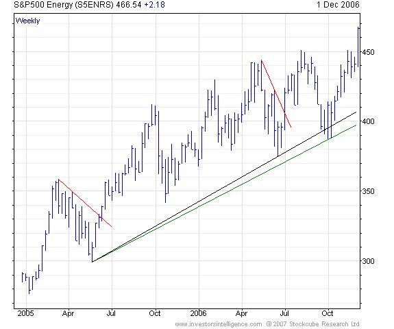 The black long term uptrend was the uptrend that existed upon achievement of the higher high during the summer. This line was broken by the decline to the October low. Once the latest high was achieved, the long term up trendline could be redrawn as the green line.
It should be clear that the breaking of a trendline does not necessarily mean the end of a trend. Instead, we have a three stage process for a change of trend.
1. A trendline is broken.
2. The trend stops making higher peaks in an uptrend (or lower troughs in a downtrend but we will use the uptrend case to explain).
3. Price moves below the preceding trough (in an uptrend).
This defines a change of trend from uptrend to downtrend. A problem exists with this in that the analyst cannot be sure that stage two has occurred until stage three happens. At best, suspicions may mount that stage two has occurred only after a significant fall towards stage three. Also, it may be the case that the lower trough occurs first (as is the case above). The analyst then needs to see a lower peak and for final confirmation, another lower trough before a reversal from uptrend to downtrend occurs.
This is all very well as a textbook theory but in the real world can involve substantial loss. Therefore augmenting this trend analysis with momentum studies (dealt with in subsequent articles) can help avoid some of these losses.
The trendlines above only touch the price bars twice. Should price touch and rally from an up trendline, that is said to validate the trendline and more notice should be taken of it. At times, a trendline will be broken slightly, perhaps on an intraday basis before recovering. In this case, that should validate the trendline rather than question it. There is no hard and fast rule as to what level of penetration is needed before a trendline is questioned. It requires judgement, this is an art not a science.
Some critics of the discipline question the existence of trends, claiming that the market moves randomly and therefore cannot be forecast. Rather than get bogged down in a statistical argument, the easiest way to counter this case is to look at real world charts.
The chart of the S&P 500 Index over the last 10 years shows three clearly identifiable long term trends.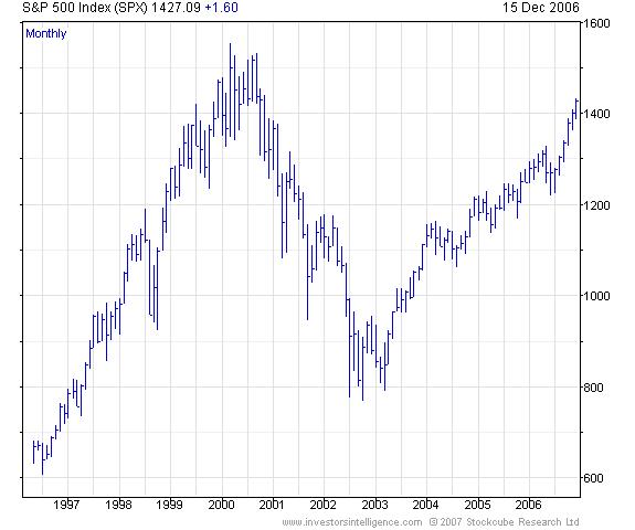 As we have discussed, the fact that people act in crowds helps propagate trends, but the strongest and longest trends require good fundamental justification to back them up. This justification may not be fully recognised until near the end of the trend but as technical analysts, we will have already identified the trend well before then.
John Ritchie, MSTA
Technical Analyst
Investors Intelligence
December 2006