Indicators And Other Tools
A variety of indicators are available to the technical analyst to supplement the price charts.
Chief amongst these are:
1. Volume indicators
2. Momentum indicators
3. Moving average indicators
4. Breadth indicators
Volume indicators
The volume traded during a period can indicate the strength of backing there is for a price move. This can be particularly important when judging the likelihood that an important price move will hold. For example, a break of resistance on high volume is more bullish than a break on low volume. The high volume suggests the presence of large players in the market that have the potential to buy more. High volume can also suggest a consensus, which is desirable as long as it is not excessive. If price rose due to a few buyers, with most participants not trading on a low volume day, that does not represent a meaningful shift in investor psychology. If however volume increases hugely and price accelerates, that can exhaust the buying power. Uptrends require a steady, sustainable bullish consensus.
In a healthy uptrend, volume should increase with the trend and decrease on the countertrend moves, showing more buying power behind the rallies. This is referred to as volume ‘confirming’ the price trend. This can be judged by observing the volume bars below the price, although that is a somewhat clumsy and imprecise method.
The high volume on 14th & 15th September in Persimmon (PSN) confirmed the rallies of those days, the second of which broke resistance. This confirmation ‘predicted’ higher prices.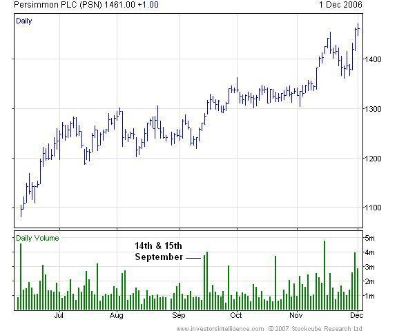
To get over this ‘eyeballing’ comparison, a cumulative volume indicator; the ‘On balance volume’ (OBV) is used. This has a cumulative total, to which the day’s volume is added or subtracted, depending on whether price rose or fell. This presents a moving line of volume. With this, new price highs need to be confirmed by new OBV highs for the volume trend to be healthy. Once this is no longer the case, the OBV is said to ‘diverge’ from the price and long positions should be questioned.
This concept of divergence, when an indicator does not confirm a new price high (or low) is where all four of the indicator types listed come into their own. The OBV can be modified to take account of the extent of the price change but the principles remain the same.
Momentum indicators
Momentum measures the strength of a trend, the ‘oomph’ behind a price move. The three most commonly used momentum indicators are the Relative Strength Index (RSI), Stochastic and Moving Average Convergence/ Divergence (MACD). The first two are range bound between zero and 100 and the extremities of this range are the oversold and overbought regions. We shall focus on the RSI, but with all three, divergence is the most useful concept.
Example: USD/ZAR
The US Dollar made a new high against the South African Rand in late September/ early October, but this was accompanied by a lower RSI value than at the June high, whilst still in the ‘overbought’ region above 70. This suggested that the new high should not be trusted and the rate subsequently sold off.
RSI divergences are perhaps the most reliable ways of telling us when not to follow simple ‘buy’ signals formed through higher peaks and troughs. They work over daily and weekly timeframes. The divergence requires both RSI peaks to be above 70, in overbought territory (or below 30 for a trough in oversold territory). Formally, the full divergence signal is not given until the intervening RSI low is broken but in practice, achievement of the second, lower overbought RSI merits at least defensive action.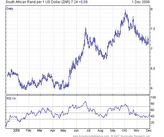
Moving average indicators
A moving average plots the average of the preceding X plots, where X is a user defined number of time periods to be included in the average. The average can be calculated as a straight forward average of the last X periods (a simple moving average), or it can place greater importance on more recent prices (an exponentially smoothed moving average). It is usually calculated on the closing price of a period but can be on the high, low or some combination.
The moving average is overlaid on the price chart and its purpose is as a smoothed representation of trend and therefore as a trend following device. Note, the MA is a lagging indicator, as it always has some older data holding it back. This contrasts with leading indicators such as momentum or volume, which can give their signals before the price moves.
The number of periods in the average can be high, to produce a smoother, longer term trend indicator or low, to produce an indicator that is closer to the price and follows more of its twists and turns. Which period of average is chosen depends on how active a trader you wish to be, how much drawdown is acceptable before a signal is given and how much you can tolerate false signals. In this sense there is no ‘right’ answer and often, two moving averages are used to get a long and short term picture.
It is relatively easy for moving averages to be optimised, to see what worked best over a previous period. Analysts should use a MA that has had some success at identifying turning points in the past, but should also be aware of the well worn phrase ‘past performance is no guarantee of future performance’.
A moving average ‘buy’ signal is given by the price crossing from below the average to above it. Some people qualify this by stating that the moving average itself should be rising, or at least looking like it is turning up. Another qualification widely accepted is the price should close above the MA, as an intraday move below the MA represents the MA providing support. The chart below shows some moves down to a 150 day moving average. The price only closed below the MA once (in May), despite many intraday moves below it. However, the MA never turned down and so using both of the above filters would have kept the trader in the trend. The MA provided further support on an intraday basis in mid November, so this 150 day MA has some validity.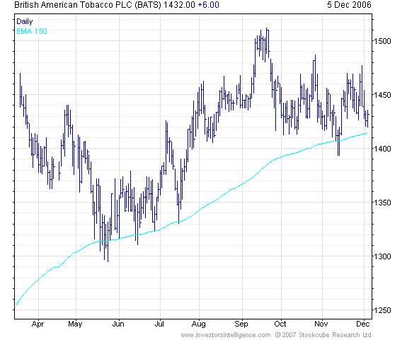
Signals can be given by the crossover of two MAs. Here, in a ‘buy’ signal, we are looking for the cross of the shorter term MA above the longer term MA. A ‘sell’ signal is given by the shorter term MA moving below the longer term MA. Since 2000, this dual MA system has worked very well on the FTSE® 100 Index. Of course, we did not know in 2000 that this would work so well! Having seen these moving averages keep an investor out of the bear market, there was a bullish crossover in mid 2003, which was a signal to re-enter the market from the long side. A sell signal was not given in August 2004 and the buy or ‘long’ signal has remained in track. Now, with this crossover method having some historical success, it could be used as a long term sell signal.
As with the signals on price bars, a filter can be that the MA lines should be rising for a buy signal to be valid and falling for a sell signal to be valid. Given that MAs are a trend following tool, they are not so useful in trading ranges, such as at the 2000 top formation. They are best employed after a trend has become evident.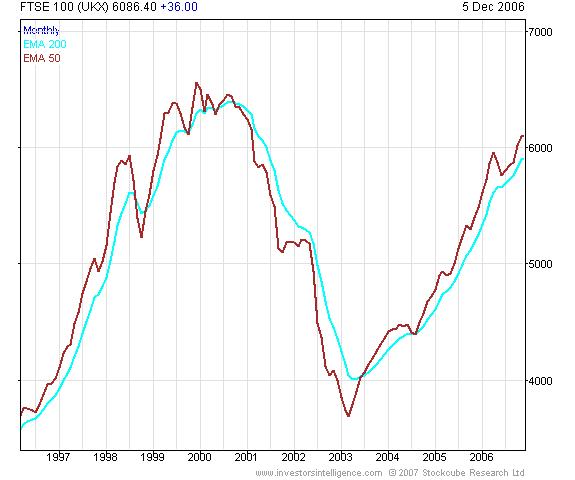
Overextension within a trend can also be spotted using MAs. Moving Average Bands can be placed a fixed price difference or percentage either side of the MA. Touches of the bands either side can be used to place trades counter to the preceding short term trend. Of course, these bands are more valid when price has previously turned back at those levels.
Breadth indicators
Breadth indicators measure the proportion of stocks in a group that are rising at any point in time. This can be extended to any group of entities, such as a set of commodities. Defined, calculable criteria for deciding whether a stock is rising are needed, it cannot be an opinion. There are only two states each stock can take; rising or falling.
The idea is to identify times when breadth is oversold, i.e. a low proportion of stocks are rising, which may mark the end of a decline. Similarly, a very high proportion of stocks rising may mark the end of an advance.
One criterion for deciding whether a stock is rising or falling is whether the stock is above or below a certain period moving average. For each day, the percentage of stocks above their 30 week moving average can be calculated, with this percentage stored and plotted against time.
The chart below shows the FTSE® 100 Index and the percentage of stocks in the index trading above their 30 week moving average. Since the bear market low, falls in this percentage to around 40% have coincided with times that the index has found support. This situation, where an identifiable ‘oversold’ level exists is far more useful than when the market rallies from varying breadth levels.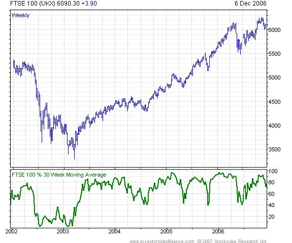
Breadth charts differ in shape at peaks compared with troughs. Trough formation, at least within an uptrend, tends to be a quicker process than peak formation. This is because the emotions of fear spread quicker than a consensus that things aren’t so great after all!
Within an uptrend, breadth peaks form before price peaks. This is because if breadth falls from 80% to 60%, that is still more than half of the market ‘going up’ by some definition. This leads to breadth divergence, which almost always is in place at a peak. Divergences can exist for a long time before a market does peak however. The same can apply in an extended downtrend; notice that the breadth indicator did not make a new low in 2003 at the bottom for the FTSE® 100 Index.
At Investors Intelligence, we calculate breadth indicators for market indices, sectors, commodities, and currencies. We use several criteria for the ‘rising’ or ‘falling’ decision and even calculate breadth on the relative strength against the wider market of stocks in a sector.
John Ritchie, MSTA
Technical Analyst
Investors Intelligence
December 2006