Signals And Chart Patterns
One of the most straightforward ‘buy’ signals is given when the price makes a higher peak after a higher trough.
On the breaking of potential resistance formed by the previous peak, the buy signal is given. So, a buy signal in Exxon Mobil is given on the breaking of the green line and at the breaking of every other subsequent minor resistance level. This way, we trade an uptrend.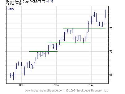
In the same way, a simple ‘sell’ signal is given by the price making a lower trough after a lower high.
Some signals work out very well, as above and some will be given, only to fail quickly. Note how $70, $72 and $75 are resistance levels which, when broken become support levels. We can use momentum and volume indicators, discussed in the next chapter, to try to decide which signals are more likely to work.
This sort of ‘buy’ signal does not get the trader into the market at the bottom, or out at the top, but in a trending environment, attempting to do that could see you cut yourself out of some perfectly good trades.
At other times, in a market with a sideways trend or a slight uptrend but with a wide range, employing this kind of trend-following signal can result in very clumsy trading.
Consider the following chart of Citigroup Inc.
The last two ‘simple’ buy signals on this weekly chart, shown as black circles, have proved disastrous. However, an attempt to buy Citigroup on a pullback to the up trendline in July would have proved worthwhile – if a daily rather than weekly chart was used. p>
The message is that we have to assess the primary trading characteristics of the stock before deciding what types of signals to focus on. The three main types will be trending (up), trending (down) and ranging. This primary characteristic should be determined by reference to a long-term chart.
Also, the technical analyst will vary the timeframe over which these buy and sell signals are given, dependent on the broader chart picture. Doing this is something that cannot be laid out formulaically and will come with experience.
Chart patterns
As discussed in an earlier section, recognisable chart patterns occur because groups of people (crowds) have recurring psychological reactions to their experiences in the market. Some of these patterns can take years to develop but some form over intraday timeframes.
Patterns can be split into continuation and reversal patterns. Reversal patterns are better known because for many people, the idea of picking a turning point in a market is more attractive than the idea of entering a market well into an existing trend.
The best known reversal pattern is the head & shoulders reversal pattern. These can be top or bottom patterns, as can all reversal patterns. This pattern formed at the low in the S&P 500 Index four years ago and we will define the pattern in terms of the base rather than top example. The pattern has three troughs, the middle of which is lower (the head) than the two shoulders.
The peaks between the head and either shoulder can be joined by a line extending to the right. A break above the line after the right shoulder is considered to complete the pattern and implies higher prices. Of course, potential resistance from either of the two peaks could come into effect. Waiting for a break of these resistance levels gives a further confirmation but a worse entry level.
The double and triple top (or bottom) reversal patterns are similar in that they involved a market that fails to make a significant new high and then breaks an intervening low or lows. They are just classified versions of the trend reversal criteria laid out in chapter two.
Additional clues during the formation of these patterns that they are not part of a trend continuation can come from volume and momentum indicators. These will be described in the next chapter but it is enough for the moment to say that if these indicators show weakness at tops, the trend may not continue and a top formation could be in the making.
The inability of a market to push far beyond the simple buy and sell signals given can also be an indication that a trend may not continue. We showed failed simple buy signals for Citigroup but for the S&P 500 Index, the market low in 2002 was a ‘sell’ signal that failed to hold at the low.
A much quicker forming reversal pattern is acceleration. This occurs when the crowd rush into (or out of) a market in an increasingly uniform consensus, which increasing optimism (or pessimism). This proves unsustainable, because what drives a market higher is not the static levels of bullish and bearish participants, it is the people switching from the bearish (or neutral) camp to the bullish camp. At the end of the acceleration, there is no-one left to switch over to drive the trend further. The unwinding can be equally fast, fuelled by those closing their positions. This occurred at the May 2006 high in gold, see below.
Remember, acceleration is an early signal; it will be seen ahead of the reversal. Thus, is should be seen as a yellow light. Get ready to close your positions, but don’t pull the trigger just yet.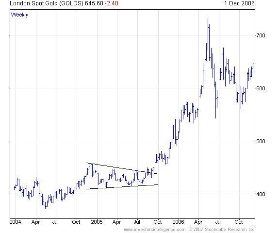
Continuation patterns are often just consolidations in a price trend, relieving the overbought (gone far enough, fast enough) condition of the market. In some cases the shape of the pattern has meaning in terms of market psychology.
During the first half of 2005, gold formed a symmetrical triangle continuation pattern. This is characterised by a narrowing range. This kind of pattern is unsustainable; eventually the upper or lower boundaries will be broken. When the pattern breaks to the upside, those with short positions have to buy them back and this adds fuel to the buying power of those opening positions following the simple ‘buy’ signal.
Variations on this triangle are the ascending and descending triangle. An ascending triangle is a consolidation after an uptrend with horizontal resistance but rising lows. This means that buying is coming in at higher levels as time progresses, whilst resistance is at a constant level. This makes it slightly more likely to break higher than the symmetrical triangle, which has resistance at lower levels during its formation. A descending triangle comes after a downtrend. Support is constant but rallies meet resistance at progressively lower levels, giving a bearish bias.
John Ritchie, MSTA
Technical Analyst
Investors Intelligence
December 2006